Community
How the Magenta Colour Code Can Elevate Your Designs
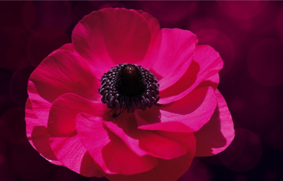
Magenta often gets bad press, with people relegating it to discount flyers and childhood memories, but it’s one of the most powerful colours for elevating designs. The magenta colour code (#FF00FF), a vibrant mix of red and blue, is a game-changer for designers. It has the power to add unexpected energy, sparking user engagement in a way that safer options might not. Below, we explore magenta and the ways it can elevate designs.
An Introduction to Disruption
The modern world is saturated with content fighting for attention, making it difficult for brands to stand out. This is where disruption can help. This concept is about creating chaos, but it’s just as much an attempt to break free of the expected to fuel conversation.
Disruption in design comes in many shapes and sizes, from unexpected bold colours to unexpected elements on a user interface. The key to successful disruption is intent; integrated elements must be purposeful with a clear message.
Think about Airbnb’s approach to accommodation or Apple’s minimal logo design. These brands dared to stand out, putting a sense of novelty into their industries. This didn’t just lead to user engagement, it completely revolutionised how users look at their respective categories.
A willingness to incorporate disruption into designs opens up a world of possibilities. It lets you create designs that last long in your audience’s memory. The next time you hit a creative roadblock, consider playing around with a single unexpected element – like adding magenta to a dull colour palette.
The Appeal of Magenta
Magenta draws attention with its boldness, but its appeal runs much deeper than this. Magenta has a rich history and symbolism that marries it with the concept of disruptions.
Throughout history, magenta has been linked to innovation and pushing boundaries. It contributed to artistic movements of the 19th and 20th centuries, welcomed by artists like the Impressionists and Futurists, because of its ability to evoke pizzazz and energy. Magenta’s presence in these artistic movements highlights its connection to breaking away from traditional palettes and exploring new ways to see the world.
Moving onto a psychological take on magenta’s appeal, the colour is attributed to a collection of positivity, including:
- Confidence. The boldness of magenta breathes self-assurance, making it a great choice for designs looking to make a statement.
- Creativity. The vibrancy of blue and red ignites imagination and encourages unconventional thought, perfect for adding a dash of innovation to designs.
- Energy. The lively nature of magenta creates movement and excitement, just the solution for grabbing user attention.
All of these qualities make magenta a powerful colour for any designer’s toolbox, especially if they’re trying to create impactful experiences and break the norm.
Tapping into Magenta’s Potential
We’ve already established how magenta fits into disruption, so let’s move on to the practical components of design. For example, magenta is a versatile colour with many shades. Pastel shades of magenta can add whimsy and playfulness to designs, while more saturated shades make powerful statements. However, it’s important to consider colour placement, like using magenta to draw attention to important elements.
Magenta can also be used in conjunction with other colours, allowing a captivating blend of visual intrigue. Consider the following options for your next design:
- Keeping things analogous. Choosing colours next to magenta on the colour wheel, like oranges and purple, creates a cohesive and harmonious aura.
- Complementary contrasts. Pair magenta with complementary colours like green, making for an eye-catching and vibrant design.
- Neutrals as a base. With neutral colours like grey, white, and black as the base, magenta can be used to highlight features vibrantly.
Function with Flair: A Look Past Aesthetics
While magenta can attract visitors’ gaze, it’s also a great asset for elevating the overall user experience (UX). Strategic placement of magenta can lead users through a natural flow, highlighting important information and increasing user interactivity. For example, bright magenta can highlight clickable buttons, making them stand out from the rest of the content. Remember, if you’re trying to use disruption successfully, you have to consider visual elements that can make the UX more intuitive.
Magenta can help cut through the overwhelming noise of constant content, which is why it’s become a secret weapon for designers. With bold energy and rich symbolism, magenta can breathe life into the dullest of projects, speaking to user engagement and leaving lasting impressions. The next time you’re staring at a project with nothing but tumbleweeds in your mind, experiment with the allure of magenta and the power of disruptions.